 Color plays an important role in the mood of a photograph. Deliberate uses of the color spectrum can heighten the specific effect you are wanting to portray, but sometimes by default, how you use color will generate a variety of moods. Lets take a look at three basic colors, Red, Blue, and Green, and see how they affect the mood of a photograph.
Red along with its variations of orange and yellow, denotes passion and aggressiveness, or playful and energetic, and sometimes happy and friendly. When used in a photograph red variations can be used to bring attention to a specific area, or shake up the composition. Red variation in an image can bring life to what might otherwise be an ordinary composition.
Blue, on the other hand, denotes trust and serenity, along with a calmness not always found in other colors. Depending on if you use a light blue or a darker shade, blue can bring a refreshing energetic element and liveliness to an image. Using a blue gel on a speedlight setup in the corner of a room can cast a cheery flavor across the room when used as a subtle accent.
Green then denotes stability and a natural state. One feels comfortable and at home with shades of green and it acts like a counter balance to bolder colors that may be found in the composition. It softens the impact of the image.
In the photograph of the National Corvette Museum full moon image above there are two basic colors with an orange shade of red along with blue as the primary colors. The contrast between the two bring an element of power and purpose to the image with the power of the reddish light bringing attention to the Sky Dome and the blue of the sky bringing a calm serenity to the image. Although they are different colors, the vibration they create seems to work well here.

This next image uses a combination of light blues and greens along with some yellow and orange accents. The prevailing green color provides a level of serenity to the scene where the contrasts of yellow and orange brings a powerful message that comes with the change of seasons. Yellow is simply an interim color between red and green and so it blends the two traits into a mood where the viewer senses not only the subtle calmness of the location but the more aggressive strength of the moment. The viewer at once wants to both be there and also feels at home at the same time.

Even indoors when using artificial light, color becomes an important consideration creating a photograph with impact. The picture of the young lady in the flowered light blue dress used a mix of artificial lighting to achieve some of the same effects we've discussed so far. Along with a front facing softbox to illuminate the model, a single speedlight with a blue gel attached was fired from the corner on the right to throw a subtle blue cast across the scene. Primarily it was used to bring a cheeriness to the room by filling the room with a pale blue tint that reflected off the many shiny surfaces and to help accent the blue dress. It also provided a trusting calmness to the scene. In the background another speedlight with a reddish orange gel was fired into a dark corner to bring life and attention to the depth of the room. It also served to contrast with the blue to warm up the mood with a more aggressive flavor.

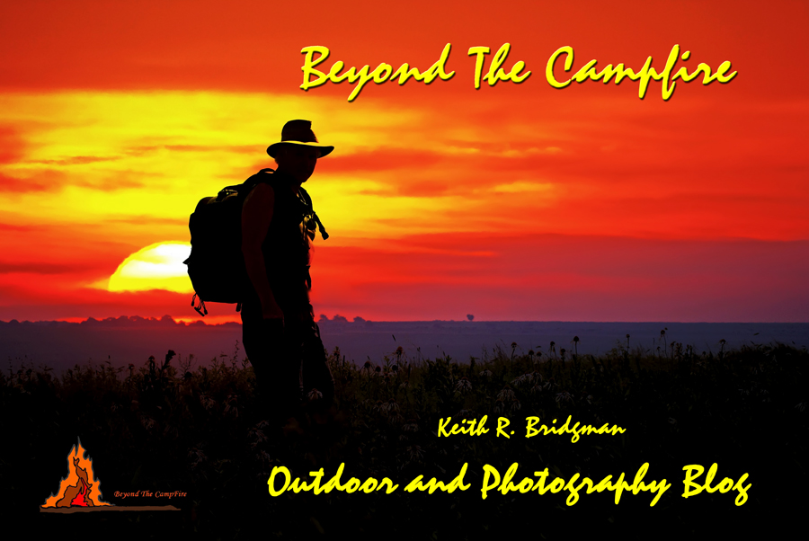
The last image is from the banner page of this blog site. It contains a powerful aggressive message designed to capture the attention of visitors to the site. The bold reds, oranges, and yellows overpower the image to such a degree one hardly notices the more subtle bluish gray horizon line and the subtle green hue of the field of coneflowers. It does exactly what it was intended to do; generate an emotional response in the viewer to such a degree they want to see more. One can feel the movement in this image almost as though this image might be a single frame from a powerful introductory video.

Lighting, regardless if natural light or artificial light, is not necessarily always something that must be precisely measured. In many cases if not most of them, catching the light just right is instinctive and intuitive at the same time. It also requires some experimentation. I go by the adage of it's right when it looks right and I don't always over work the process, don't always rely on the histogram or the exposure meter. The in-camera metering is simply a tool I use to get a ball park beginning exposure setting. From there I compensate the exposure up or down and adjust the lighting until I get the desired look. When it looks right...I know it...and sometimes right doesn't always mesh with what the book says it should be.

Color then can be used to bring a specific kind of life to your images. By watching for and using the colors of found in nature, then enhancing them through exposure and composition, one can generate visual moods to such a degree, the viewer may not even realize they are being inspired by what they see. Photography is all about light for a great many reasons, not the least of which is because the colors of light are what generate the mood of your photograph. You should always desire more from your camera than a simple xerox copy image of what you see. Understanding and knowing how to capture and use those colors effectively is key to creating images with a powerful impact.

