Sunday, February 5, 2023
Using Backgrounds to Complement, Enhance, and Support an Image
Friday, January 27, 2023
Looking for Complementary Colors in Nature Photography - Visualize the Potential
The concept of Complementary Colors is rather simple and involves two colors that fall on opposite ends of a color scale. Yellow and purple, Red and Green, are two common ones but the combinations range across the entire spectrum of colors and they do not necessarily require them to be directly opposite of each other, just within the color range being used, like shades of yellow and blue, or shades of orange and green.
After watching this informative program, I began to wonder how this concept applies to photography. As I browsed through a few recent photos I started to notice a common thread between many of them. It was obvious that complementary colors were a major part of the appeal to the images. I did not realize it at the time the photos were taken, but my eye naturally seemed to navigate toward the appealing nature of this concept.
Digging deeper into the phenomena, more and more images began to materialize with the prevailing theme of complementary colors. Some were bold and bright, others more subtle. For some, one major color dominated with only a hint of its opposite being there, while with others the distribution of the color was more evenly divided.In some instances a progressive layering of color flowed across the image shifting from one extreme to another, but fully encompassing the complementary elements. In some cases, there were subtle variation like deep browns taking their place within the color realm of red while its opposite complementary color varied in various shades of green and pale yellow.
It became apparent that nature is filled with complimentary colors and our eyes are naturally drawn to those combinations. What this revelation accomplishes is to open your mindset boldly enough to generate a desire to actively seek out these kinds of combinations while photographing nature.
Many times when I am out attempting to capture a unique image, I find myself struggling to see the moment. When this happens, and it does happen a lot, I slow down and simply ask myself, "What is it I'm seeing that is catching my eye...what is drawing me to itself?"
Before long, I begin to notice small subtle compositions and more often than not, there is an element of complementary color to it.
The Moon Rise photo taken at the National Corvette Museum is an example of very bold color variations that not so subtly adhere to the complementary color theme. Within it you see the bold, redish-orange glow and reflection of the SkyDome and even the moon's glow, which are set against the bluish, purple backdrop of a dusky sky.Thursday, January 19, 2023
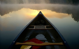
Behind the Scenes - How the Photo was Made: Canoe Sunrise on Shanty Hollow
Shanty Hollow is about a 120 acre lake situated in northern Warren County in Kentucky. Surrounded by woodland rustic hills, covered in cedar, pine, and hardwoods, it retains a northern boundary waters atmosphere. There are hiking trails and a 60 foot waterfall tucked into the apex of a rock-walled ravine.
Considering how relatively small the area, it is perhaps the most scenic of locations I've ever photographed. Year round it possesses a charm and exotic flavor to it that many much larger and expansive locations lack.Later that morning I returned home and loaded the images. Only a small amount of tweaking was required, a little contrast, a little brightness, a point or two of saturation. The photo pretty much stood on its own merits and, as an image, it became one of my favorites. As an experience, well, that morning was second to none.


