ESTABLISHED 2010 - Beyond The Campfire was created to encourage readers to explore the great outdoors and to observe it close up. Get out and take a hike, go fishing or canoeing, or simply stretch out on a blanket under a summer sky...and take your camera along. We'll talk about combining outdoor activities with photography. We'll look at everything from improving your understanding of the basics of photography to more advanced techniques including things like how to see photographically and capturing the light. We'll explore the night sky, location shoots, using off camera speedlights along with nature and landscape. Grab your camera...strap on your hiking boots...and join me. I think you will enjoy the adventure.

Thursday, February 16, 2023

What Makes Great Light? - Shoot the Angles

A line of thin clouds drifted a few degrees above the western horizon as the sun hovered between their opaque layers. This late afternoon light just before sundown cast a softly, shadowed, golden glow across the corn stubble field spread out in front of me. I hunkered behind a makeshift blind made of camouflaged burlap with my camera peeking over the top edge. Dressed in full camo myself I hoped to blend into the dark green backdrop a cluster of cedar trees provided. 

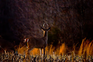
Across the field almost directly in line with the setting sun a few deer meandered here and there feeding on various shoots and probably spilled corn that still sat in the fields. One of them was a young little buck with what appeared to be a set of spike antlers, but turned out to be a set of six point antlers that protruded almost straight up. The closer he came, the more photos I snapped, none of which I felt were too exciting. Just as he approached the woods to my right, he stopped and the sun slipped below the thin veil of clouds throwing a warm glow across the field and into the woods. The little buck turned toward the woods and lifted his antlered head with an alert posture. The angle of the sun was such that only a few highlights accented across his form and the edge of the woods were bright enough to see clearly. I adjusted my exposure, purposely underexposing the image so just the highlights would become prominent. I snapped a couple of shots just before he again dropped his head and meandered into the woods.

Later that evening as I thumbed through the images from the days shoot, I wasn't impressed with all that many of them. Most were simply ordinary, until I came across this last series. With a closer look, the image stood apart from all the rest as the light created a unique look, a look that was enhanced by the angle and color of the light.

What makes good light when it applies to photography? The answer of course is rather subjective as it depends a great deal on what you attempting to photograph. However, when I dig into the question as it applies to how I approach photography, it becomes apparent that the angle of the light is a key ingredient. If you follow this blog very much at all, you will discover that many of the articles deal with light and how it by far is the most important element in nature or landscape photography. Subject matter is important for sure, but without extraordinary light, any natural subject will look, well...ordinary. 

When I browse through my favorite images, one thing stands out; virtually all of them were made using light coming from an angle. Angled light is what creates shadows and highlights. It also illuminates the subject in ways that direct light cannot. Angled light will often penetrate through the subject generating a luminosity that will often set the subject aglow. This after-glow gives life to the subject, especially things in nature like plants and clouds, and small critters. It brings out detail that would not be seen otherwise. It really does not matter what your subject is whether it be a person, a wild animal, a tree, a cloud, a single leaf, a flower, a drop of water...I could go on and on, angled light is the key to capturing mood and emotion.

 A single flower illuminated with front light may capture a technically good photograph of the flower suitable as an illustration, but will stir little or no emotion from the viewer...and being able to generate emotion is what sets apart ordinary photos, from extraordinary photos.

Even soft diffused light can be considered angled light because the light comes from all angles and thus illuminates the subject along with the background with a natural glow. This can also be used creatively within a wooded environment where only diffused light filters downward, through the canopy of trees to cast a muffled arrangement of light onto the subject.


Angled light is what I look for whenever I am in the field regardless of the conditions. Some days are better than others, sometimes it just does not happen, and other times you hit it just right.

 So, what makes great light? Well, it is light that falls outside the ordinary to enhance the moment, suspending your imagination beyond what is simply visible, to transport your imagination into the sublime where awe is not only inspired, but is potentially elevated into excellence. 

Sunday, February 5, 2023

Using Backgrounds to Complement, Enhance, and Support an Image

Any photograph that catches the eye will possess a multitude of combined characteristics to generate an emotional response. Most of us instinctively understand this and recognize the results whenever we see a good photograph. Things like focus, point of view, rule of thirds, subject, composition, color, and one very important element, light, among others, are some of the things a good photographer will look for and apply to his photography. However, it is easy to overlook one part of the equation; Background.

The background in a photograph can make or break the image. How we as photographers use this is as varied as there are numbers of photographers. From my perspective, whenever I frame an image, I subconsciously view the image from the foreground, across the middle, and through to the background. My eye rapidly advances across and around the frame to visualize what is there before I snap the shutter. It all happens in an instant and when it looks right, well the mind just knows it. Backgrounds then, for me, become the most powerful portion of an image next to light and just like bad light, a weak background can ruin a photo. They need to possess at least three qualities: It should Complement the subject, not compete with it, It should Enhance the overall impact of the photo, not detract from it, and it should Support the overall story you are wanting to portray. Let's take a look at each of these qualities starting with Complement.


A background should never compete with the subject. In the photo above, the simple green background complements the single flower. It was created by using a long focal length about 300mm, and a relatively large aperture probably f/5.6, plus the background was far enough away to allow for it to fall well outside the depth of field inherent in the exposure values. There is nothing here to compete with the subject. By compete I mean for it to be so out of place, it confuses or distorts what the subject is suppose to be. Things like powerline's are big ones. I see this all the time where there is a reasonably attractive photo with a series of black powerline's crossing overhead. 


Sometimes things like useless clutter that has no bearing on what the photo is suppose to be about can become a distraction. Many times clutter can be caused by using the wrong lense, or the wrong aperture settings which can cause distant objects to  remain in focus and thus compete with the subject. Many time this can be remedied by a simple change of perspective or angle. It is the photographers duty to recognize those things and choose a background angle that complements the subject. Also beneficial is to understand the use of Depth of Field. Defining depth of field, simply put, is that portion of an image which remains in focus while objects outside of the focal range becomes blurry. Things like what aperture is used, focal length of the lense, and the distance to the background come into play. Generally speaking, the larger the aperture the narrower the depth of field. Factor in focal length, and distance to the background, and distance from the camera...well, there are a good number of factors that affect depth of field, but using it effectively will strengthen how you build backgrounds that complement your subject.

 Complement simply means to separate and lift the subject away from distracting elements. Using a long lense, 200, 300, 500mm, and a large aperture , f/3.5, f/4.0, f/5.6, to blur out the background is one common technique to accomplish this. The use of soft, complementary colors is another technique. The background should be there just enough to know there is something there to identify a location or a moment or event. The angle and color or temperature of the light are powerful tools to apply as well. Also, a dark or light background will often serve to isolate the subject depending on the setup.


Not So Good

A background should also be able to Enhance the subject. To enhance means to make the subject stronger than it might be otherwise if it was against a mediocre background in so-so light. The image of this Cormorant is a good example of a not so good background in harsh light. There is not much appeal to this image...it's a snapshot taken in bad light with an uninteresting background taken from a bad angle. The image below of Sandhill Cranes is a much better example of how background and light work together to generate a wildlife image with much greater appeal. Wildlife photography is a entirely different animal because environment is as important as the subject. Capturing both effectively can be a challenge.


That leads into how Backgrounds should Support the subject. It matters not what the subject is. The background has to support the subject. For wildlife, think environment, for still life think in terms of effective use of lights and darks and color and how the background should impact of the image. For nature or landscape, Background is critical. Take a look at the Damselfly image below. Notice how the use of color and a soft background supports, enhances, and complements the subject.

There is just enough detail in the background to identify it as lush creekside foliage without it becoming a distraction. Also the first black and white image at the top effectively uses soft detail. Notice how the background sort of blends away into the fog leaving the subject standing apart from it.

Sometimes, the background actually becomes the subject. This can be tricky, but all the elements still apply. The image below of the reflections across this backwater slew is an example of how the background actually is the subject, yet it complements the subject story by the flavor of the moment. It enhances the subject with effective use of light and shadow, and it supports the essence of the story by blending all of the elements into a single story, a single moment of light.


Effectively using backgrounds will help to generate strong, story-telling, images. By applying a few simple techniques and training your eye to visualize how the background will complement, enhance, and/or support your image, what you create begins to express images with greater impact displaying more emotions and feelings as opposed to simple snapshot qualities. Recognizing those potential moments of light comes with experience. Applying that knowledge comes with practise both visual and mechanical.


Friday, January 27, 2023

Looking for Complementary Colors in Nature Photography - Visualize the Potential

 The other day I was watching one of those Create programs that featured a landscape painter. In this particular episode, the painter was in Venice and spoke at length about some of the old masters whose paintings effectively used what is called Complementary Colors. 

The concept of Complementary Colors is rather simple and involves two colors that fall on opposite ends of a color scale. Yellow and purple, Red and Green, are two common ones but the combinations range across the entire spectrum of colors and they do not necessarily require them to be directly opposite of each other, just within the color range being used, like shades of yellow and blue, or shades of orange and green.

After watching this informative program, I began to wonder how this concept applies to photography. As I browsed through a few recent photos I started to notice a common thread between many of them. It was obvious that complementary colors were a major part of the appeal to the images. I did not realize it at the time the photos were taken, but my eye naturally seemed to navigate toward the appealing nature of this concept.

Digging deeper into the phenomena, more and more images began to materialize with the prevailing theme of complementary colors. Some were bold and bright, others more subtle. For some, one major color dominated with only a hint of its opposite being there, while with others the distribution of the color was more evenly divided.In some instances a progressive layering of color flowed across the image shifting from one extreme to another, but fully encompassing the complementary elements.  In some cases, there were subtle variation like deep browns taking their place within the color realm of red while its opposite complementary color varied in various shades of green and pale yellow. 

It became apparent that nature is filled with complimentary colors and our eyes are naturally drawn to those combinations. What this revelation accomplishes is to open your mindset boldly enough to generate a desire to actively seek out these kinds of combinations while photographing nature.

Many times when I am out attempting to capture a unique image, I find myself struggling to see the moment. When this happens, and it does happen a lot, I slow down and simply ask myself, "What is it I'm seeing that is catching my eye...what is drawing me to itself?" 

Before long, I begin to notice small subtle compositions and more often than not, there is an element of complementary color to it.

The Moon Rise photo taken at the National Corvette Museum is an example of very bold color variations that not so subtly adhere to the complementary color theme. Within it you see the bold, redish-orange glow and reflection of the SkyDome and even the moon's glow, which are set against the bluish, purple backdrop of a dusky sky.


Although this not a nature photograph per se, it is a strong example of how the natural blend of complementary colors projects a powerful influence on our ability to recognize and see such things within our world.

A more subtle use of complementary colors can be seen in the image of yellow blooms set against a shadowy, bluish backdrop. Taken around the perimeter of a pond on an overcast day, the soft color variation blends well to create a mystique that fully uses the influence complementary colors has on our senses. 
An even more subtle use of this influence can be found in the image of a Ring-Billed Gull backlit against the shadowy bluff in the background. The shadowy bluff provides the contrasting bluish purple tone, and the gull's natural buff and white tonal shades provides a soft yellowish glowing complement to the background shade.

 There is even a bluish gray tonal value across the length of the wings. The combinations are very subtle, but they do exist and offers an interesting blend of contrasty backlight.

Even the banner page on this blog is filled with eye popping complementary colors.

Complementary colors in nature are nature's attempt at creating beautiful combinations of light.

 Many times, as photographers we are naturally drawn toward those combinations, but just as many times we may not even realize why we are attracted to such lighting effects. When we consciously make an effort to recognize how powerful and even how subtle these combinations are, you may find yourself taking another step toward being able to visualize the potential even before you ever snap the photo.