ESTABLISHED 2010 - Beyond The Campfire was created to encourage readers to explore the great outdoors and to observe it close up. Get out and take a hike, go fishing or canoeing, or simply stretch out on a blanket under a summer sky...and take your camera along. We'll talk about combining outdoor activities with photography. We'll look at everything from improving your understanding of the basics of photography to more advanced techniques including things like how to see photographically and capturing the light. We'll explore the night sky, location shoots, using off camera speedlights along with nature and landscape. Grab your camera...strap on your hiking boots...and join me. I think you will enjoy the adventure.

Saturday, February 3, 2018

The Power of Tonal Values

Ever heard of the Zone System? If not it is an exposure method championed by Ansel Adams where you can assign different tonal values to the scene you are photographing. Those values run from completely black to completely white with varying degrees of gray spaced between. In the middle is the neutral middle toned gray value.


In this post we're not going to become too deeply involved about how to use the Zone System, but we are going to look at how and why understanding the Power of Tonal Values is important.

First of all, this graduated scale applies to all colors and every color when applied through its full spectrum will have a middle tone value. To keep things simple we're going to look at only the gray scale, but keep in mind the principles apply to all colors.


What your camera's metering wants to do is give you an average of the light it detects. It doesn't matter if you use a full matrix metering or single spot metering. The results are going to be an average of all the tones and brightness values it see's. Matrix metering does a pretty good job of getting the overall exposure correct, but it is still just an average. So if you point your camera at a black wall the camera will want to make that black wall appear a middle toned gray. Point it toward a white wall, and again it will shift the exposure so it appears to become gray. That is why when we take pictures of snow, where the snow is dominant, it can appear to be gray.

I use matrix metering most of the time simply because it does a pretty good job of averaging out the exposure, however I will use spot metering under certain situations. Spot metering allows for metering a single small area and using that reading as the basis for setting your exposure. A good example of this is to meter a models face when there is a great deal of back light. (Peoples faces do have different tonal values of course depending on their complexion due to their race or lifestyle.) A bright back light can confuse matrix metering into thinking it needs to shift the exposure down to turn it into that middle toned gray. This will cause the models face to become much darker than it actually is. By metering on her face, locking the exposure in based on that middle tone, the camera will ignore the back light and expose for her complexion.


Neutral tones also contribute to landscapes. A good landscape image especially a black and white image, will possess a range of tonal values from almost pure white to almost full black. When the scene contains a variety of tonal values, matrix metering works pretty well to capture the full range of values. Sometimes in post processing you can enhance a certain value such as bright or dark areas to add a higher degree of  tonal complexity to your image. Doing so gives the image a great deal more depth.


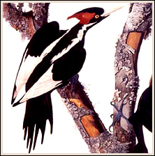
Notice the image above. In this picture you will find tonal ranges that run the full spectrum from almost white to black with just about every tone of gray between. A slight tweak in Photoshop helped to enhance the bright areas, and bring life to the various middle values. When viewed as a larger image you can easily see how it has a great deal of depth to it. This is how you use the power of tonal values to its fullest. Knowing how your camera will react to the available light, will give you a greater ability to create images with depth.

When your subject has a dominant tonal value like a snow scene, you must always expose for the brightest area. If you simply allow you camera's metering to do what it wants, it will always give you a middle toned value, but you can compensate for that by using the Exposure Compensation button on your camera. That is the +/- button most often located on the top or on the back of your camera This allows you to tell your camera to add light or remove light from the exposure it wants to use. Take snow for instance. If your scene is dominated by the snow, your camera will want to make it look grayer than we want. To correct for this, simply move the +/- setting into the + side. The +/- settings are broken down usually into 1/3rd stop values like 0.3 stop, 0.7 stop, 1.0 full stop all the way to as much as 3.0 stops brighter or darker. How much to move it depends on the situation and requires a bit of experimentation. Sometimes + 0.3 is all you need, sometimes +1.3 is required. What you have to do is to avoid over exposing the snow...a little gray is okay because snow does have texture and we do not want to blow it out.


The photo above demonstrates this idea pretty well. There is a tinge of gray in the snowy areas because there is texture filled with shadows and exposed material across the snow, but the snow itself appears white. Again this image contains a full range of tonal values.

There are situations where an object or scene contains a splash of white while the rest is mostly middle toned values or darker. If  you simply expose for the darker areas, that white splash can often be blown out. In that case, you can use the exposure compensation in the opposite direction and drop it into the minus side, something like -0.3. This will slightly darken the middle values, but will keep the white splash from being blown out.


This color image of Sandhill Cranes is a good example of using the minus compensation value. Of course this was all preset before the birds took flight. The background was a bit darker than middle value, so I wanted it to look that way, but the birds were a middle toned gray, yet they have some white splash across their wings and under their chin. By presetting the exposure with a minus compensation, I was able to retain a full range of tonal values. Much of this comes with experience and experimentation...sometimes a good guess helps as well.

When there is a strong mix of light and dark values in a scene, there are times when employing a slight reduction in light will work to your advantage. The next image contains a wide mix of very bright and rather dark areas. If we are not careful, the darker areas will fool your metering into thinking it needs to brighten the exposure more than it should. This can often result in blown out light areas. So by employing a slight minus compensation value something like -0.3, you can still retain detail in the dark and light tones without blowing out the white areas. Also, remember shadows, either cast or deflected, are good on snow. They add detail and form to what can often look rather flat. A little gray is okay because it helps to define texture in snow. All you need is an illusion of white...almost white...with a tonal value slightly grayer than pure white to make snow look great.


There is no real cut and dried method to using tonal values in your photography, it is important however to understand the principle and then applying it to your photography. Sometimes we guess right and sometimes we don't, but to simply allow your camera to do what it wants to do all the time will result in average photographs. To capture the world in such a way as to bring depth and strength to the composition, employ the power of tonal values to what you are doing.


Monday, January 29, 2018

Another Wonderful Kentucky Sky


About a year ago I stumbled onto a location where a few isolated trees offered a nice opportunity for an interesting photo shoot. The trees were not unique and appeared much like any of the other ordinary trees you can find in Kentucky. The unique thing about these trees was they grew isolated in a small clump along a high spot that allowed them to be silhouetted against the sky. As luck would have it, they were also located at a bend and split in the road allowing for easy access. A small cemetery was also located inside the triangle space where the trees were growing adding to the country flavor of the location.


Even though sunset photos can more often than not, offer more of a cliche than a unique composition, I still enjoy photographing them. Usually broken clouds are required to produce that amazing glow in the sky we all enjoy. But, sometimes a cloudless sky can also create a tremendous amount of color and glow at sundown. The trick is to place something in front of the setting sun to break up the scene and allow the drama of color to unfold. It is also important to understand how your camera will react to this kind of light.


Let's take a look at a recent shoot and see how these images were created. The first thing to remember is what your camera's exposure meter wants to do. If everything is set to neutral settings and you simply allow your camera to set the exposure it wants using a priority or programmed mode, it will set an exposure that will bring the scene to a middle tone value. If what you are looking at is indeed a middle value then you can trust your cameras metering. If however it is very bright, the camera will darken it some to achieve that middle value exposure. If it is dark, then it will brighten it some to achieve the same results. Boosting or retarding the exposure by employing the +/- exposure compensation value button will tell your camera to add light or remove light from the exposure value it want's to set, or, you can set everything manually and compensate up or down either your aperture or shutter speed. We're going to assume you have at least a fundamental understanding of this principle.


The idea behind this particular shoot was to capture the glow in the sky behind the trees without blowing out the sky or making the sky appear too dark. Your camera has an uncanny ability to accumulate light and transform it into a range of colors you simply cannot see visually. In this case, I positioned myself where the sun would fall behind the clump of trees and I waited...taking a few shots here and there to test the results of the exposure. When the sun finally set below the horizon, all that was left in the sky was that glow. I wanted the shot to enhance this glow, to give the sky that radiant after sundown appearance. For the composition I placed the trees high in the sky and slightly offset with just enough of the ground along the bottom to comfortably anchor the scene.

Your camera will interpret this after sundown glow as a middle tone value and create a wonderfully graduated color effect that radiates away from the brightest center portion. What you must avoid is allowing the scene to become too dark or too bright where all the detail in the sky is lost in either blown out values or so dark they cannot be seen. A silhouette against this sky glow is what I was shooting for. A simple application of the +/- compensation to brighten or darken it will bring your exposure into a comfortable range. It takes a little experimentation to achieve the desired results. Using the tress to add interest and form enhances the compositions value by creating a simple yet pleasing layout. What might have been an ordinary, cloudless setting sun most people would simply ignore, became a wonderfully magical moment where the sky, the trees, and the light combined to generate a fun photograph.

I also managed to take some video footage for this years Adventure Photography Video series which was included in the previous post. All in all, it was a fun outing and I was able to once again take advantage of another wonderful Kentucky sky.

Friday, January 26, 2018

Beyond The Campfire Adventure Photography Series - Kentucky Sky

It took two tries, but I finally was able to capture the sky along with some video footage I wanted for another short Adventure Photography Series video. The first attempt resulted in an entire series of video footage that was out of focus...most definately user error. Anyway, I figured out what I did wrong and made some corrections and was able to return the next day to discover the exact same conditions as the day before.

This is a short video highlighting a shoot at dusk against another fantastic Kentucky sky. Just to keep things simple and to create a sense of continuity I used the same musical score which I will probably use for all of the adventure photography series videos.

Please enjoy...

Thursday, January 18, 2018

Shanty Hollow Adventure Photography Video - Part 1

Well, I just could not stand to stay inside in spite of the frigid temperatures, bad road conditions, and snow on the ground. Quite frankly, it was perfect for an adventure photography outing and Shanty Hollow was the perfect location to get started.

I had a great time stomping around the hills and bluffs, slipping like a toboggan on the slick trail. For the first time I took some video footage to support the Adventure Photography concept. It was a learning experience with more to come.

Check out the video posted on the page...I think you'll like it.


Sunday, January 14, 2018

A New Endeavor for Beyond The Campfire: Video

It's a new year and Beyond the Campfire is moving forward to something new. We're going to create and post a series of Adventure Photography videos and I'm excited about the prospects. We'll keep it simple and stay close to home. Some of the topics we will attempt include a multi part series on Shanty Hollow, one of my favorite Kentucky places. We'll do some Hiking, some Fishing, Canoeing, and even try to capture on video one of the most intriguing phenomena I've ever encountered, The Summer Bats of Shanty Hollow. Along the way, we will include some photography how to video clips along with some of the still photos we take, and we will still make a regular blog post from time to time.

We also plan on taking some hikes and/or backpacking trips across Mammoth Cave National Park, just up the road. It's a great place to get away from the grind and enjoy a near wilderness adventure. There will be other adventures that come along, but for now we'll just throw out a few teasers to spike your interest.

This is a new endeavor for Beyond the Campfire, but we will make every effort to make it a high quality attempt. Check out the Intro Video now available on the main page.


Wednesday, January 10, 2018

Impactful Image Design - Unlocking Emotions Thru Composition

Photography is an emotional medium. Through it photographers find a way to express how they see the world, but creating an effective emtional stirring photograph requires the photographer to understand the principles and application of composition. The world is full of visual chaos characterized by all kinds of shapes, textures, and movement. Your job as a photographer is to create order out of that chaos and to find the most impactful composition. This job is best accomplished by understanding how to design an image.


Composition is too complex of a concept to fully cover in a simple blog post. Even so, it is such a key element of photography, we're going to look at some ways to inspire your compositions to help you create images with impact.

Composition simply defined is how you arrange the elements within your photograph.  Designing your image compositionally requires you to visualize two things: First is the Arrangement of the Elements, and second is How you use Colors to complement both the arrangement and the subject. It is not as complicated as it sounds so try not to over think the process. Allow your visual senses to tell you when it is right. Over time and with practice composition becomes instinctive...you will simply know it when you see it. The trick then is to learn how to visualize the image before you frame and then capture your story. There is no one right way to do this. More realistically, all of us must learn how to draw upon our inner sense of what visually looks right to us and use it to instinctively build an image. Place two photographers in front of the same subject with the same camera and lens and you will get two completely different compositions because we all place value on what we see in the world based on our own experiences.


Placing value on what we see is a key component to effective composition. Every good photograph will have a dominant subject or element. Placing a high value on that dominant element allows it to become the most important part of the process of seeing the shot. There are ways to isolate and bring to life your dominant subject, things like lens selection, aperture, vertical or horizontal framing, and using the background. Color and texture along with light angles and contrasts also are important to bring dominance to your subject. The dominant subject should also relate to the lesser elements within the photo, but remember that a simplified image is a more effective story telling image than one with a great deal of unrelated clutter on it. It does not mean your image lacks for complex detail, it simply means your dominant element becomes the priority component within the story by default when you compositionally remove all the competing junk. Everything in the image must be there for a reason and must not compete against the overall theme or storyline of the image. The key is to bring to life the dominant element so it becomes the center of attention.


Be careful to avoid always evaluating the importance of an element based simply on emotion. Emotion is certainly important, but sometimes it will cloud your vision causing the graphic design elements required for a good composition to be over looked and possibly lost in the clutter. Constantly be aware of what is in the background. Look for hot spots, and components that do not belong in your photo. Always think graphically and use the elements you are seeing in ways that enhance their importance. Lens selection can become a vital tool in helping you isolate what is truly important. Look at the scene and ask yourself  'What is actually capturing my attention here,'  then allow your efforts to focus in on the single most important impact making component. This is almost always where the most emotion can be discovered. Emotion is best defined through an effective use of light and color. Once all the important elements are defined and the unnecessary elements eliminated, the visual impact driver for the emotional element takes over.

Color is one of the most important graphic elements and influences the design process. Knowing how your camera reacts to light and captures color, or controlling white balance, is key to allowing color to become one of the dominant traits. Color projects a powerful visual message with different colors invoking different emotional responses. Warm colors such as reds or yellows are powerful emotional elements and generate a different response than cool more soothing colors like blue or green. Sometimes contrasts in color can generate a tremendous visual appeal by exploiting the natural vibrations between the colors. Using color is also why shooting early or late in the day is important compositionally. Those times of day will most often generate an overall warm or cool tone across your image.


Let us not forget an important basic design element: The Rule of Thirds. If you have been studying photography for very long, the concept of Rule of Thirds should already be ingrained into your mindset. If not, Rule of Thirds is simply a way of breaking the image into three distinct areas like a tic-tac-toe grid roughly at 1/3 intervals where important elements fall on or near where the lines cross. This just simply makes for an easy and more pleasing basic arrangement of the elements within the composition. The offset arrangement of the lines creates a wonderful and more interesting placement of your subject. The idea here is to avoid putting your main subject dead center in your image. Sometimes this works, bust most times it does not. I see it all the time in less accomplished photographers, yet it is an easily corrected problem simply by observing and understanding compositional rules. Also remember, being in the right place at the right time is critical for capturing images with impact. Doing so requires a willingness and ability to look beyond the ordinary to see the extraordinary potential of a location, and then making sure you are there at the optimal time. Lighting angles, time of year, time of day, weather conditions all play a part.


Composition is a complex design process filled with an almost infinite variety of possibilities. Sometimes the rules need to be precisely followed and other times breaking the rules will stir things up and create an interesting and effective composition. Hopefully, this short post will get you to thinking about how to unlock emotions through your picture design and with the use of effective compositional components.

Sunday, January 7, 2018

The Trials and Tribulations of a Bird Watcher

About 35 or maybe 40 years ago I was out stomping around in an Oklahoma woods one day when a tiny bird fluttered into view. As often is the case, tiny birds like this one rarely linger very long before flittering off and so it was with this particular bird. Even though he was situated inside some heavy foliage, he did perch long enough and close enough for me to get a pretty good look at him and for the life of me, I could not identify what kind of bird he was. He was a medium greenish color, darker on top than on bottom, with a slight marking across his eye and white slashes across his wing and was maybe at most 4 inches or so long. On my way home I decided to find out what kind of bird it was.

Sissortailed Flycatcher - Oklahoma State Bird
Of course back then there was no such thing as the internet, you had to manually look up stuff at the library or buy a book or something to help you find things. I was so intrigued by this strange looking little bird that I purchased a copy of A Guide to Field Identification of North American Birds. It's one of those Golden classic field guide books with all the great paintings of just about every bird that fly's across North America. I spent several hours thumbing through that book and never did positively identify that little bird. The best I could do was make an educated guess that he was some kind of Vireo. But which one?

Nuthatch
It was the which one question that launched me into the world of bird watching. For several years I kept a list going but discovered just how difficult it really was to distinguish between one type of bird and another who looked very similar. There were times I was sure I had identified a particular bird only to discover that particular bird didn't range in the area I found him and only existed far out west. I wasn't very good at the craft needless to say, at first anyway, but improved and learned a few tricks and things to help out. I'm still not very good at it, but even after all these years, I will make time to spy on our feathery little friends, mostly photographing them from time to time, but some time just watching them.

Purple Finch
Kris and I both have been fascinated with a family of Robins who for several years have returned again and again to the same nesting location built in the fork of a little plum tree growing in front of our porch. We've seen several generations of Robins hatch, and grow, and fly off from that little nest. I'm gusessing of course that it is the same family, but I do believe it probably is as they seem rather protective of the location. If any other bird or Robin comes too close, well, they take a defensive posture and run them off.

Downy Woodpecker
Bird watching sometimes comes across as a rather passive activity in which only old folks and mild mannered people participate. Contrary to popular belief, it is a difficult and challenging activity that requires much more than random luck to be successful. The birds are even more difficult to photograph. You must be detail oriented and look for those tiny differences that identify a bird, things like is there a ring around the eye, or a slash in front of or behind the eye? What about the wing markings or the tail markings? How large is the bird, what kind of beak does it have? How does it fly, flutter or straight. What song does it make? There are subtle color differences between two distinct species that look a lot alike. Does the bird even belong in this area? How about winter vs summer birds. These are just a few of the details you must become aware of when trying to identify birds.

Dicksisle - Tallgrass Prairie
At one time, like most people every bird was a sparrow to me except of course the obvious ones like the cardinal, or blue jay or something. Every little brown bird I saw was a sparrow. I didn't realize just how many different kinds of sparrows there were, and not all brown birds were sparrows. When you look at sparrows more closely with the eye of a bird watcher, they become much more than the ordinary little brown bird. They have color and crowns, and topknots. They have white throats and rusty tops. They have face paint and speckled coats. Some are very dark while others are light in tone. When God said he had his eye on the sparrow, I believe I understand why now. They are fascinating birds.

Chickadee
Bird watching can become one of the most satisfying of activities and one of the most frustrating of activities. Regardless, it is a challenge I really do enjoy.  You do need a good pair of binoculars, a good field guide, and a willingness to give it a try. Photographing the birds is a natural extension of the bird watching mystic and maybe I will do an article on another time about bird photography.

Start your birdwatching activity in your backyard, or the local park, then branch out to other locations like a lake, or beach, or along a creek. The winter is actually a good time to go bird watching because the trees are bare and it simply makes it easier to see the birds.

Lark
One thing I did is was to make some copies of a basic outline of a bird and carry them inside my field guide. When I see a bird, I do not trust my memory, so I will make notes on the outline extending the beak out to match what I see, or the tail markings and I also jot down things like how large the bird is and color markings I might see like the eye or across the back or head. With this information, I can then go back to my field guide and have a good idea of what I am looking for without having to rely on my memory. Some birds are kind of rare in a given area and that is when it becomes fun and necessary to record as many details as possible.

One day I would like to go on a canoe trip on the Bayou Deview in the Big Woods of Eastern Arkansas where tantilizing sightings of the thought to be extinct Ivory Billed Woodpecker have been made. It's the largest woodpecker in North America with the last known confirmed live sighting made in 1944. It is similar appearance to the more common Pileated Woodpecker, but significantly larger and with more white showing on its wings. What a thrill that would be to find one of those...but the odds of finding one are extremely thin, but making an effort to do so would be a tremendous challege.

Ivory Billed Woodpecker
Kris and I this year have challenged ourselves to start a new bird list for 2018. I'm looking forward to adding to the list through the year. I still have that old bird field guide. It is dog-eared and the pages are coming apart, but it still serves the same pupose as it did 40 years ago when I bought it. I'm looking forward to the rewards, trials, and tribulations of once again seriously watching birds.